

Search for Data Using Python and Loading Images into QGIS
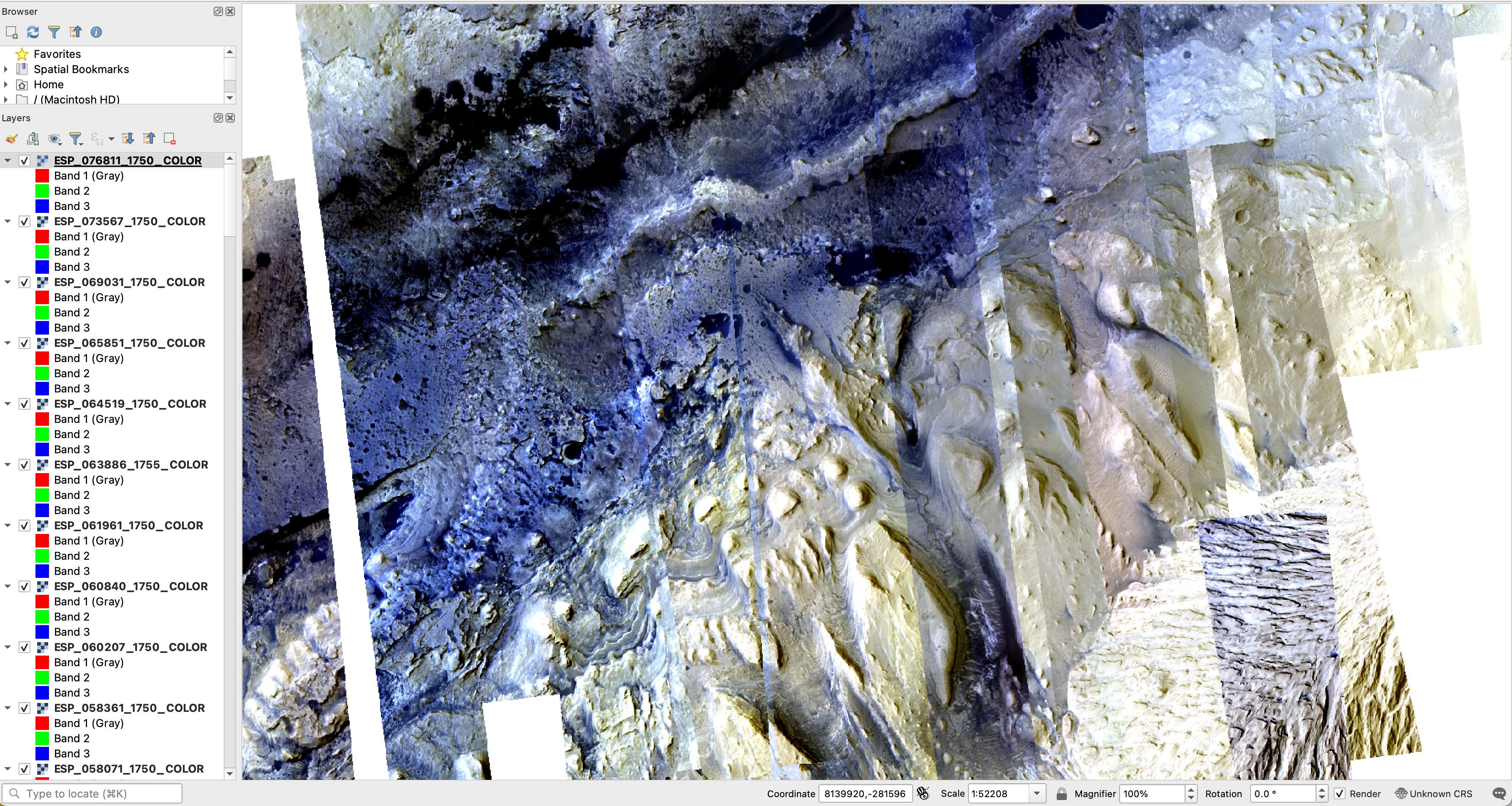
The results of this tutorial, 86 false color HiRISE images streamed from the Amazon Registry of Open Data into QGIS.
This is a work in progress. Please feel free to test, but use with caution!
In this tutorial, you will learn how to:
- searching for HiRISE data using the STAC API in a Jupyter notebook
- subset discovered data based on some criteria
- use the QGIS python terminal to load the discovered data
This tutorial is demonstrating data discovery and visualization. In this tutorial 86 individual images are dynamically streamed into QGIS.
This tutorial requires that you have the following tools installed on your computer:
| Software Library or Application | Version Used |
|---|---|
| QGIS | 3.30.1 |
| pystac-client | 0.6.1 |
| geopandas | 0.13.0 |
| pandas | 2.0.1 |
| shapely | 2.0.1 |
Over Mars Reconnaissance Orbiter (MRO) High Resolution Science Experiment (HiRISE) observations have been released as Analysis Ready Data . These data offer a spectacular high resolution view of the surface of Mars. Since it is not realistic to stream every pixel of the over 100 TB of data, the first step is to select a region of interest. For this tutorial, Gale Crater will be the focus.
To start, launch a jupyter notebook . In the first cell, all of the necessary libraries will be imported. Copy / paste the following into the first cell.
|
|
And execute the cell .
To see the API calls that make this work, adjust the log level (last line above) fromlogging.INFOtologging.DEBUG.
Next, setup the connection to the api. In a new cell, below the imports in step 1, paste:
|
|
and execute the cell.
The root of the API is a catalog. A catalog contains some number of collections. To see what collections are available, paste the following into the next empty cell:
|
|
and execute the cell.
The result will be a nicely rendered pandas Dataframe with the first column being the name of the collection and the second column being the description as reported by the server. The figure below shows the output that was returned when this tutorial was written.
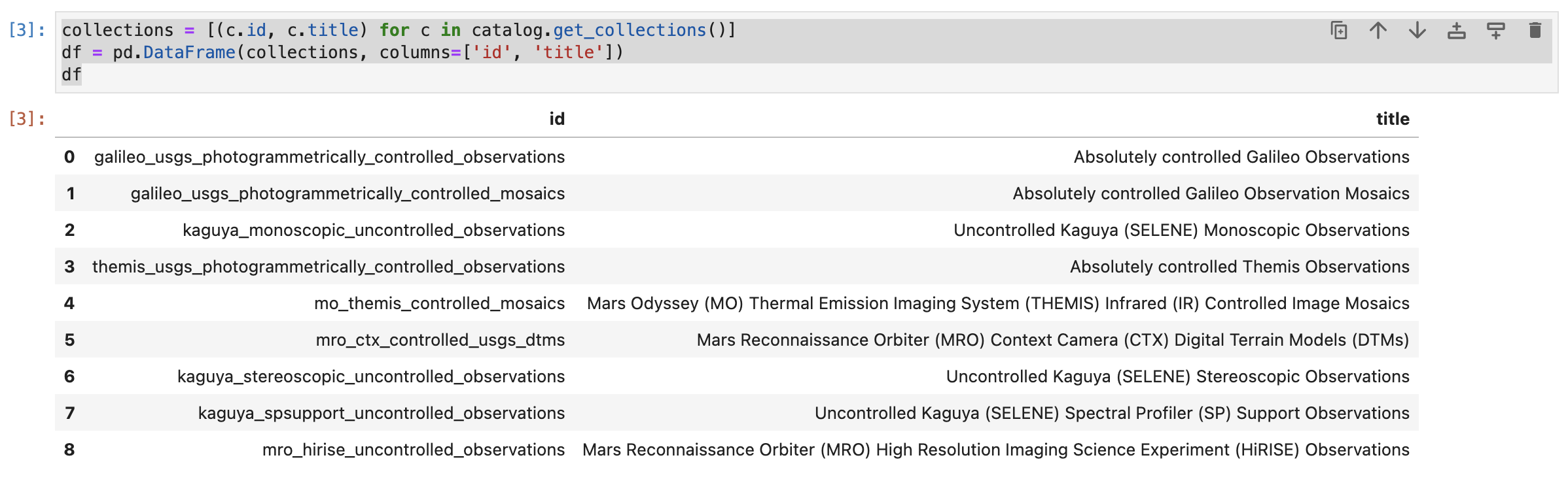
The results generated when executing the above command. These are the collections that are advertised by the API at the time of writing.
The catalog object has a search method that can be used to search for data in the API. (See the
PySTAC-Client documentation
for more information.) In the next empty cell, paste the following:
|
|
and execute the cell.
This code will search the mro_hirise_uncontrolled_observations collection, that contains the MRO HiRISE Reduced Data Record (RDR) observations. The search is constrained to only return items in the bounding box defined by the bbox argument. The bbox is in the form [minimum longitude, minimum latitude, maximum longitude, maximum latitude]. The search is limited to the first 200 returned elements. By default, the search will return 10 elements.
The API limits responses to 10,000 items or 500MB of total data returned. This is a hard limited imposed by the backend architecture. In order to return more data, one must use pagination. This is an advanced topic that is described in the stac-client ItemSearch documentation .
Data frames are a performant, tabular data structure that is widely used in data science and analysis. What then is a GeoDataframe ? A GeodDataframe is simply a spatially enabled data frame. By spatially enabling the dataframe one can ask and answer spatial questions such as which observations overlap with other observations.
The API returns JSON. The following code converts the JSON response into a GeoDataframe. Into the next empty cell paste:
|
|
and execute the cell.
The result will be a print out of the number of rows or observations that have been added to the GeoDataframe.

The results generated when executing the above command. This is a simple print response that 181 observations are in the GeoDataframe.
Because the Geodataframe is sptially enabled, one can plot the footprints. In this region of interest (ROI), there are many footprints. This makes sense because this is a landing site that was heavily imaged. If one were to alter the ROI, the density of footprints would likely be far less.
To plot the footprints simply paste and execute the following in the next empty cell:
|
|
The results are shown in the figure below.
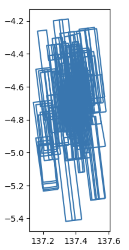
The results generated when executing the above command. This is a plot of the footprints of the discovered images.
For this tutorial, only the color images will be visualized. To do this, the GeoDataframe will be subset based on the product name. Copy, paste, and execute the following in the next empty cell:
|
|
This code makes a boolean (True, False) mask of the data based on whether or not the id contains the string COLOR, items_gdf['id'].str.contains('COLOR'). The mask is then used to select only the items that contain the string COLOR, items_gdf[MASK]. Once the dataframe is subset, the footprints are plotted as above. The result is shown below.
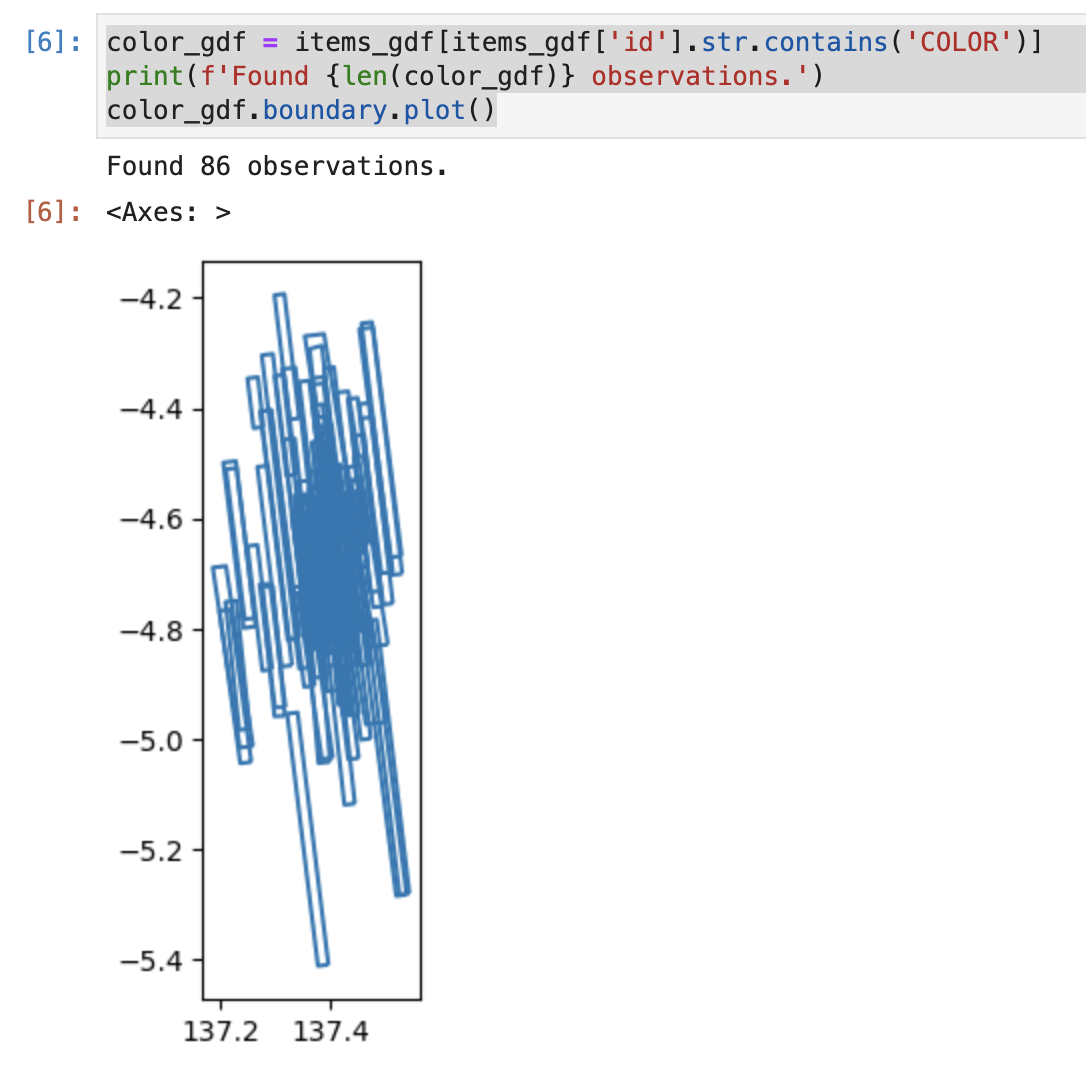
The results generated when executing the above command. This is a plot of the footprints where the data `id` contains the string `COLOR`.
QGIS is a terrific, open source tool. In order to efficiently stream and load Clod Optimized GeoTiffs, it is necessary to set a few QGIS environment variables. This is standard performance tuning type stuff. Before executing this section, please take a look at the brief tutorial on setting up QGIS for streaming data available here .
Unfortunately, QGIS does not have an easy way to bulk load many remote raster datasets. To get the data into QGIS we will make a list of the data and then use the QGIS python terminal to load the layers.
To create the list: copy, paste, and execute the following in the next empty Jupyter notebook cell:
|
|
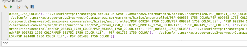
This code iterates over all of the rows in the GeoDataframe and extracts the URL for the image (assets.image.href) and the item’s ID (id). When executed, you will see a large blob of text written to the cell’s output. The output will start with [('/vsicurl... and end with ..._COLOR')]. In total, this is a list with 86 entries. Each entry contains the URL and the ID.
Highlight and copy the entire output.
Now open QGIS and select Plugins -> Python Console. In the console, type: toload = and then paste the copied text. The GIF below demonstrates this.
A GIF showing the python console, the creation of the `toload = ` variable and pasting the file list.
Next, paste layers = [QgsRasterLayer(href, name) for href, name in toload] into the QGIS python console and execute the code. This code creates a layer for each of the 86 remote files.
A GIF showing the python console and the creation QGIS layer objects.
Finally, paste QgsProject.instance().addMapLayers(layers) into the python console and hit return. Almost immediately, data should start appearing in your QGIS window. The 86 color HiRISE images in our ROI (bbox) are streaming from S3 and loading for visualization and analysis. Since all of the data are present, one can blink them on and off to look for changes, apply different stretches, and perform any other analysis one can think of!
The results of this tutorial, 86 false color HiRISE images streamed from the Amazon Registry of Open Data into QGIS.
That’s it! You now have loaded 86 individual iamges into QGIS. Those data have been discovered using the STAC search API, loaded into a GeoDataFrame, subset based on the observation ID, and finally loaded into QGIS.
If you have questions, comments, or a visualization to share, consider chatting below.
Any use of trade, firm, or product names is for descriptive purposes only and does not imply endorsement by the U.S. Government.